
How light affects your print job
You’ve sent your design files to your print shop and inspected a printed proof at their location and all the colours looked fine. When you review the final prints in your office, you notice the colour isn’t what you expected. This can be a common occurrence, and there are many factors that contribute to how we see colour. We all see colour a bit differently, but light is known to have the biggest impact on the colours we see.
Light allows us to see colour, but because light is made up of nearly every visible colour, changing light sources affects the colours we see. In this article, we’re going to tell you how light affects printing and what you can do to ensure your colours are presented the way you intended.
What is light?
Only a few hundred years ago, Sir Isaac Newton locked himself in a barn and held a prism up to a hole in the wall. On the opposite wall, he saw the clear sunlight split into several distinct colours, the same spectrum as a rainbow. Later, William Herschel moved a thermometer through this same spectrum and noticed temperature changes.
Beginning at violet, the temperature increased and then got even hotter after it passed red and went outside the rainbow, leading to the discovery of infrared radiation. The following year, ultraviolet radiation was discovered, and a little after that, a relationship between light and magnetic fields. We now understand the idea of electromagnetic radiation, with ultraviolet on one end, infrared on the other, and everything we consider visible light somewhere in-between. For the purpose of this article, we will only be focusing on Visible Light.
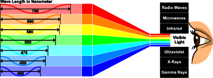
How is light measured?
A light source works by outputting wavelengths of light. How long or short these wavelengths are change the colour temperature of the light. Red lights have longer wavelengths and are warmer, and blue lights have shorter wavelengths and are cooler. For the purpose of this article, we are going to focus on the Kelvin Scale, which is the system used to measure the temperature of light. Specifically, whether the light is warmer or cooler, and what effect that this has on the colours we see.

As you can see from the image above, the Kelvin Scale goes from warmer (red) to cooler (blue) as the temperature increases. This can be a bit confusing at first since we are used to temperatures increasing as things get warmer, but with colour temperature in the Kelvin Scale, the opposite is true. When the Kelvin temperature is lower, the redder the light, or warmer. When the Kelvin temperature is higher, the bluer the light, or cooler it becomes.
Light sources and colour
Different light temperatures have advantages over others in certain environments. For example, at home you might prefer a regular incandescent lightbulb, somewhere around 2700 – 3000 K, which would be yellowish. This is generally a more calming and relaxing light. A big hardware store might use fluorescent bulbs that are “cooler” and closer to daylight temperature of around 6500 K, which is more energizing. If you were to look at a certain paint swatch at the hardware store in this bluish fluorescent light, you would perceive that colour differently when you saw it at home again under yellowish light. This same principle exists when you are looking at a print.

Many manufacturing facilities, gyms, dentist offices, or hospitals use lights in the higher Kelvin range of 4000-6500K. This light is known to improve energy levels, and as you can imagine, it is good for environments where people need to stay focused and productive. These lights generally make colours appear sharp, as they give off white and almost blue hues.
Office spaces tend to fall somewhere in-between, or have a mix of lighting over time as different people are swapping out lightbulbs rated at different Kelvin temperatures. This can make it increasingly difficult to get colour consistency.
Temperature isn’t the only variable affecting how you see colour on your print, there’s also the quality of the light source itself. In simple terms the better the quality of light, the better that light will be able to depict colour. This makes sense because light with inferior quality, even at the same daylight Kelvin temperature, could still render the colour inaccurately. This quality is measured on a scale called the CRI, or Colour Rendering Index. The scale is measured from 1-100, with 1 being poor quality and 100 being excellent quality. Natural sunlight is the highest quality light source, and will be able to depict colour the most accurately.
Take this image of fruit for instance. With a CRI 70 lighting the fruits look dull. The CRI of 88 lighting makes the fruits look more attractive. The CRI of 95+ makes the fruits look vibrant and with their true colours showing.

Keeping things under control
If you are striving for colour accuracy, controlling light sources is an important factor. Certain critical colours might look perfect at every stage until you send it to your client, then their incandescent desk lamp turns the beautiful blue trim green. In situations like this, it may be better to bring the print with you and go over it with your client under controlled light, or at the very least, check your print under different light conditions before sending it.
If you’re regularly surprised by colour not appearing as you expect, you may want to consider what you can control in your own environment. Switching light bulbs to a single type with a common temperature and high CRI will make direct light more consistent. Next, ambient light caused by windows can be covered, and reflections from coloured walls can be controlled by switching to neutral gray or white colours.
Another good solution is to have your printer supply you a printed proof so you can take it back to the environment where you will be presenting or displaying the final print, whether a home, boardroom, or tradeshow environment.

- 2021-01-22
Share this post via: